
I really like this effect as it matches the music video with the black and white theme however i believe it is quite dark making the imagery a lot harder to see and does not give connotations of warmth and simplicity.

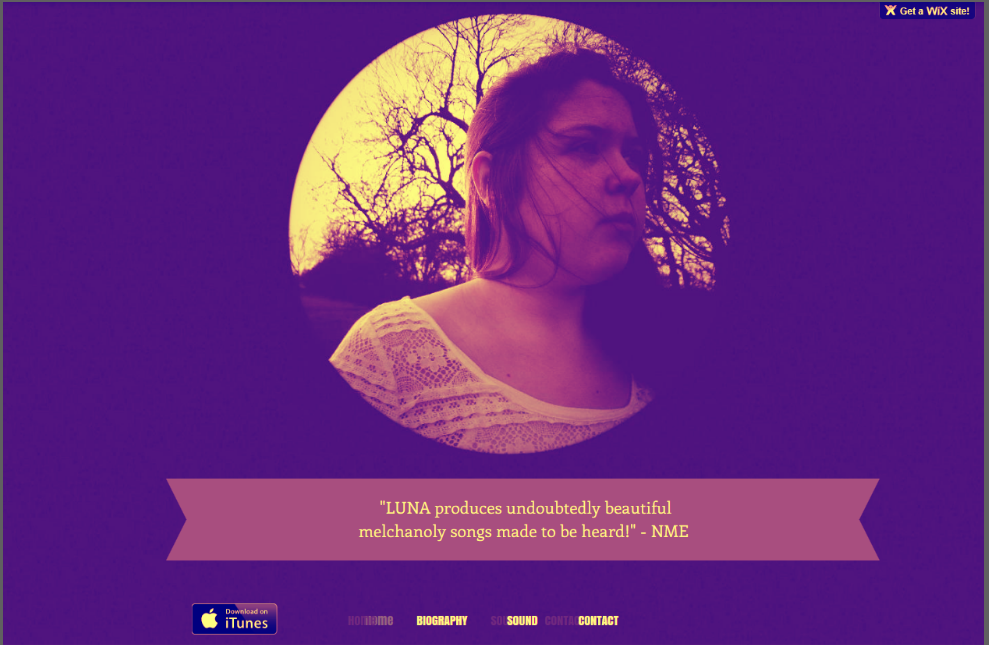
This design is very much similar to my final website design although it has a more yellows tint to it. I feel this gives the website a more vintage feel to the website which is a typical convention of the indie folk genre.
Within this design it contains more of darker blues and purples hues making the image more darker to view. I however like this design although I do not feel it is conventional of the indie folk genre.

I feel this design really captures the nature convention of the indie folk genre with the use of the solid green. Although I think this fits well, it makes the artists skin look green and not very realistic of what the artist looks like. I also feel the green is quite overpowering being the dominant colour on the website page.
No comments:
Post a Comment